Design System in Figma
In today’s fast-paced digital landscape, maintaining design consistency across multiple platforms is crucial for creating seamless user experiences. A well-structured universal design system can streamline this process, ensuring that your mobile app’s UI is cohesive, efficient, and scalable. In this guide, we’ll walk you through the process of creating a universal design system in Figma, step-by-step.
1. Introduction to Universal Design Systems
A universal design system is a comprehensive set of design standards and reusable components that help maintain consistency across different platforms and devices. It includes everything from typography and color palettes to UI components and design patterns. By using a design system, you ensure that your mobile app has a consistent look and feel, which improves usability and enhances the user experience.
2. Setting Up Your Figma Project
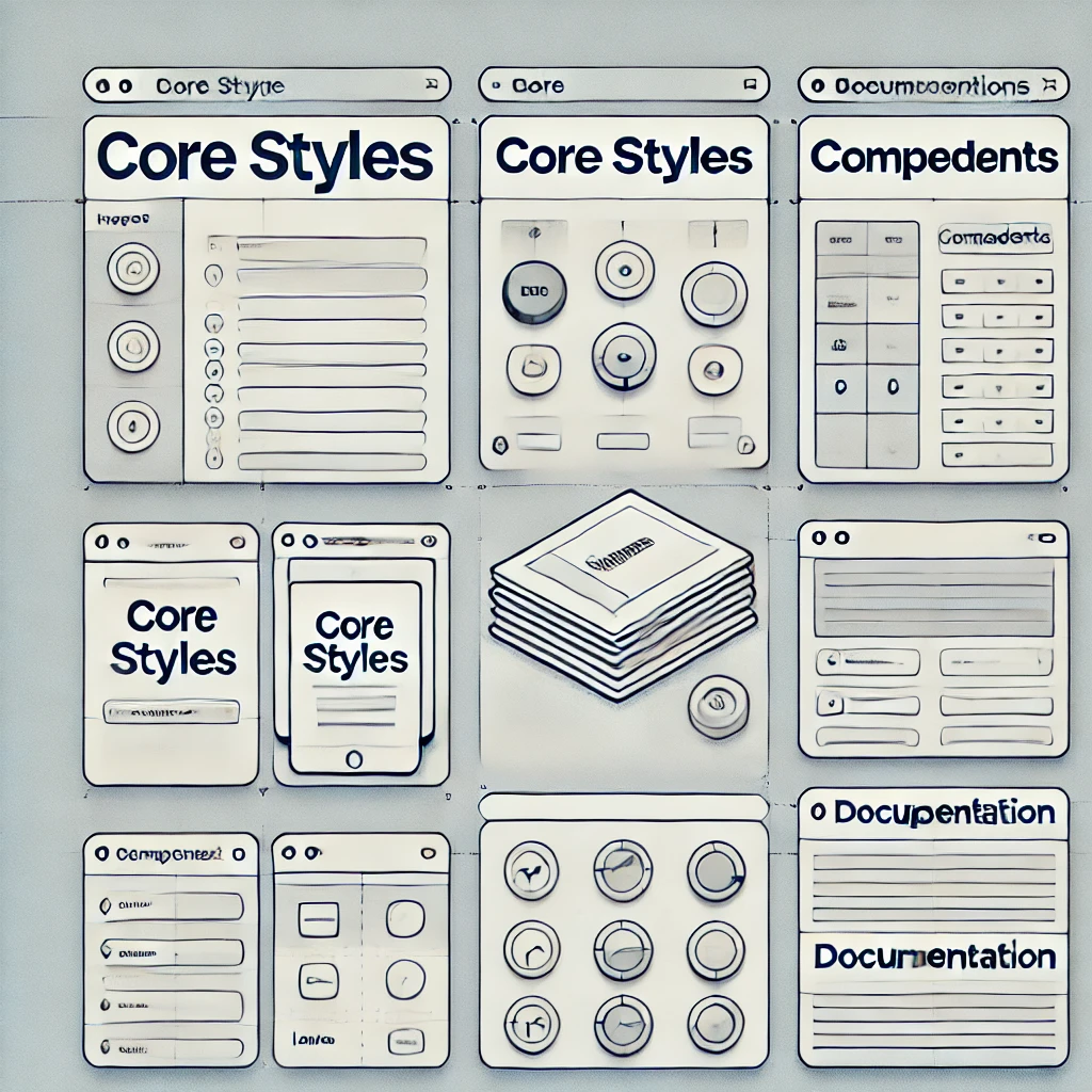
Organizing Your Workspace
Create a New Figma File: Open Figma and start a new file. Name it something descriptive, such as “Universal Design System.”
Create Pages: Add separate pages for different elements of your design system. To add a page, click the “Pages” tab in the Layers panel and then click the “+” icon. Create pages for:
- Core Styles
- UI Components
- Design Tokens
- Documentation
Set Up Page Layouts: Organize each page with clear sections and headings. For instance, on the “Core Styles” page, you might have sections for Typography, Colors, and Spacing.
3. Designing Core Components
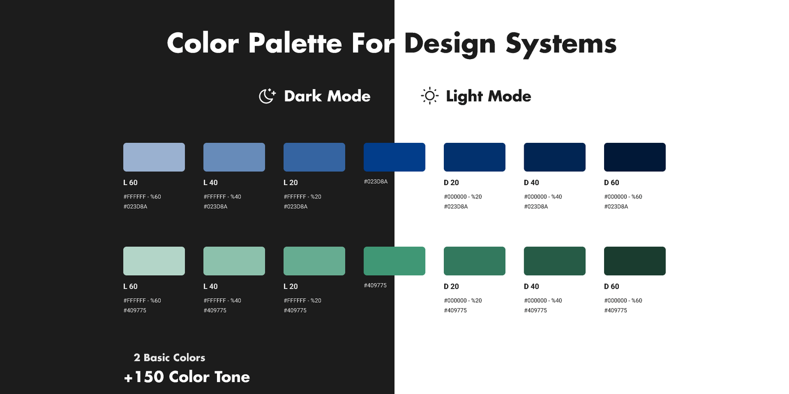
Typography and Color Styles
Typography:
- Create Text Styles: Select the Text tool (T) and type out text in Figma. Adjust the font family, size, weight, and line height as needed.
- Save as Text Style: With the text selected, go to the right sidebar and click on the “Styles” icon (four dots). Click the “+” icon to create a new text style. Name it appropriately (e.g., “Heading 1”, “Body Text”).
Color Styles:
- Create Color Styles: Select an object or shape and set its color in the right sidebar. Click the “Fill” color box, choose your color, and then click the “Styles” icon.
- Save as Color Style: Click the “+” icon to create a new color style. Name it according to its purpose (e.g., “Primary Color”, “Accent Color”).
UI Components
Design UI Elements: Create individual UI elements like buttons, input fields, and cards using Figma’s shape tools and vector editing features.
Convert to Components:
- Create Components: Select the UI element and right-click to choose “Create Component” (or press
Cmd/Ctrl + Alt + K). This turns your element into a reusable component. - Add Variants: For components with different states (e.g., buttons with normal, hover, and disabled states), use Figma’s Variants feature. Select the component, click “Add Variant” in the right sidebar, and configure the different states.
- Create Components: Select the UI element and right-click to choose “Create Component” (or press
4. Building a Component Library
Creating Reusable Components
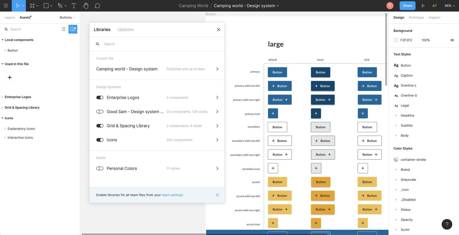
Design Master Components: Start by designing a master component for each UI element. These will serve as the basis for all instances of the component throughout your design system.
Use Variants: Add different states or variations to your components using Figma’s Variants feature. For example, create variants for different button types (e.g., primary, secondary) and states (e.g., active, disabled).
Design Tokens
Define Design Tokens: Design tokens are variables for design attributes such as colors, typography, and spacing. Create styles for these tokens in Figma.
- Colors: Define color styles as mentioned earlier.
- Typography: Define text styles as mentioned earlier.
- Spacing: Create reusable spacing values as shapes or components.
Apply Tokens: Use these styles and components throughout your design system to ensure consistency. For instance, apply color styles to buttons and text, and spacing tokens to layout elements.
"A well-crafted universal design system is the backbone of any successful mobile app, ensuring consistency, efficiency, and scalability across platforms. By building a design system in Figma, you not only streamline the design process but also create a foundation that allows for future growth and adaptability."
5. Maintaining and Scaling the Design System
Updating Components
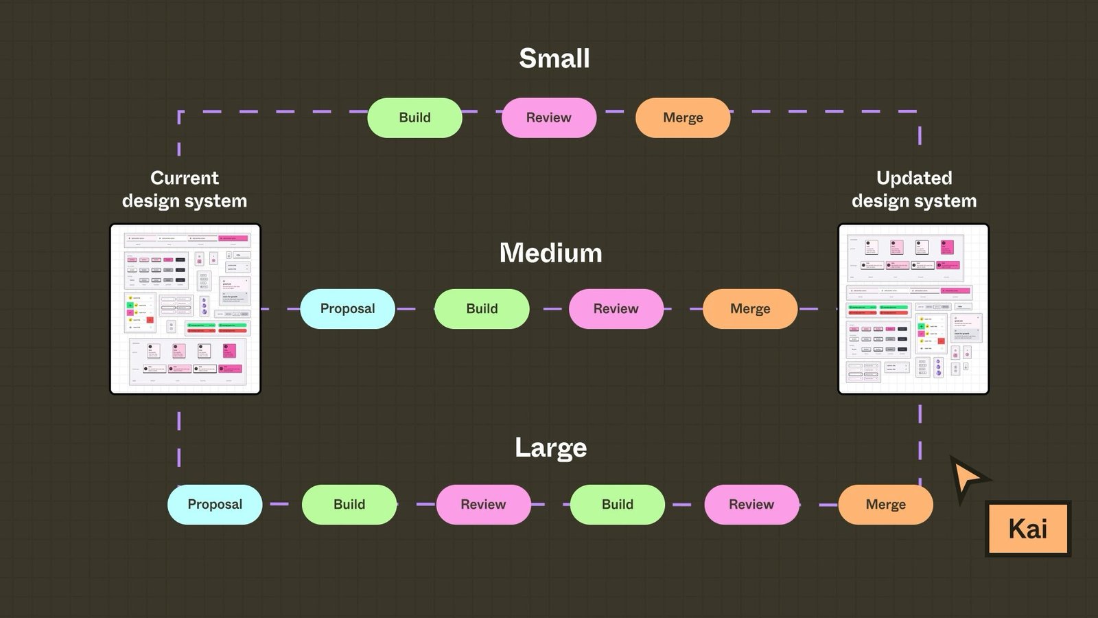
Edit Master Components: When making changes to components, edit the master component in the “Components” page. Updates will automatically reflect across all instances of that component.
Manage Component Variants: Update variants as needed to accommodate new states or design changes. Ensure all instances are updated to maintain consistency.
Documentation and Guidelines
Create Documentation: On the “Documentation” page, include guidelines on how to use the design system. Add sections for:
- Component Usage: Instructions on how to use and modify components.
- Design Principles: Guidelines on design principles and best practices.
- Examples: Provide examples of correctly applied design tokens and components.
Embed Documentation in Figma: Use Figma’s text and shape tools to create documentation directly within your design system file. This makes it easy for users to access guidelines and instructions.
6. Collaboration and Feedback
Sharing Your Design System
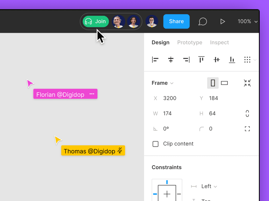
Share the Figma File: Use Figma’s sharing options to provide access to your design system. Click the “Share” button in the top-right corner of the Figma window and choose your sharing settings.
Manage Permissions: Set appropriate permissions for team members and stakeholders. Allow for viewing, commenting, or editing as needed.
Gathering Feedback
Request Feedback: Encourage team members to leave comments and suggestions directly within Figma. Use Figma’s comment tool to facilitate discussions and gather input.
Iterate Based on Feedback: Review feedback regularly and make necessary updates to your design system. Ensure that changes are communicated to all users.
7. Conclusion
Creating a universal design system in Figma is a powerful way to ensure design consistency and efficiency across your mobile app projects. By following these steps, you’ll establish a solid foundation for your design system, making it easier to maintain and scale as your project grows.
Recap and Best Practices
- Organize your Figma workspace with clear naming conventions and structure.
- Design reusable UI components and implement design tokens for consistency.
- Maintain and update your design system regularly to reflect changes.
- Use Figma’s collaboration features to gather feedback and refine your system.
For more resources and tools to enhance your design system, explore Figma’s documentation and community plugins.
